
Pages
Widget Settings
Managing and embedding support widgets
Overview
Widget Settings let you create and manage support widgets that can be embedded on your website or product. Each widget is a customizable contact form that allows customers to submit tickets directly from your site.
To access Widget Settings, go to Settings → Widget.
Widget list
The Widget Settings page shows all widgets created for your organization. Each widget displays its name and description. Click any widget to edit it, or click + Create a new widget to add one.
Creating a widget
Click + Create a new widget to open the Create Widget screen. Fill in the following:
- Name (required) — An internal name to identify this widget.
- Description (optional) — A short note about the widget’s purpose.
The widget editor has three configuration tabs: General, Start screen, and Appearance. After saving, an Embedded Code tab also becomes available.
General tab
The General tab controls the form content and behavior customers see when they open the widget.
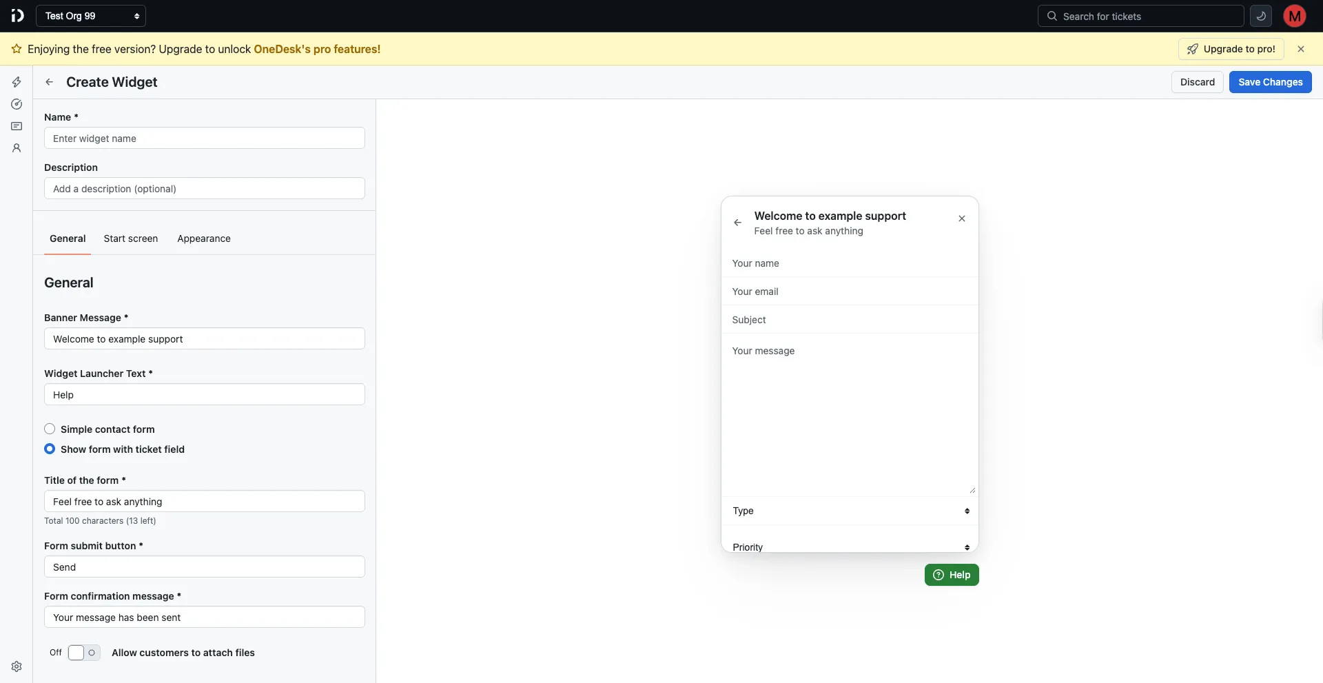
Banner message
The heading displayed at the top of the widget (e.g., “Welcome to example support”).
Widget launcher text
The label shown on the floating launcher button on your site (e.g., “Help”).
Form type
Choose how the widget form is presented:
- Simple contact form — A basic form with standard fields only.
- Show form with ticket fields — Includes your custom ticket fields (such as Type and Priority) alongside the standard form fields.
Title of the form
The subtitle shown inside the widget below the banner message (e.g., “Feel free to ask anything”). Limited to 100 characters.
Form submit button
The label on the form’s submission button (e.g., “Send”).
Form confirmation message
The message displayed to the customer after they successfully submit the form (e.g., “Your message has been sent”).
Allow customers to attach files
Toggle this on to let customers upload file attachments when submitting a ticket through the widget.
Start screen tab
The Start screen is an optional landing screen shown before the contact form. It lets customers choose from multiple support options.
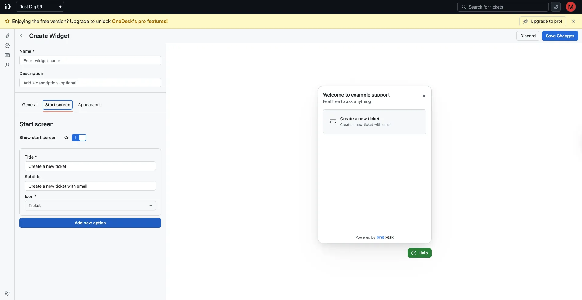
Toggle Show start screen on to enable it. When enabled, you can configure one or more options, each with:
- Title — The option’s heading (e.g., “Create a new ticket”).
- Subtitle — A short description (e.g., “Create a new ticket with email”).
- Icon — An icon to visually represent the option (e.g., Ticket).
Click Add new option to add more choices to the start screen.
Appearance tab
The Appearance tab controls the visual style and positioning of the widget on your site.
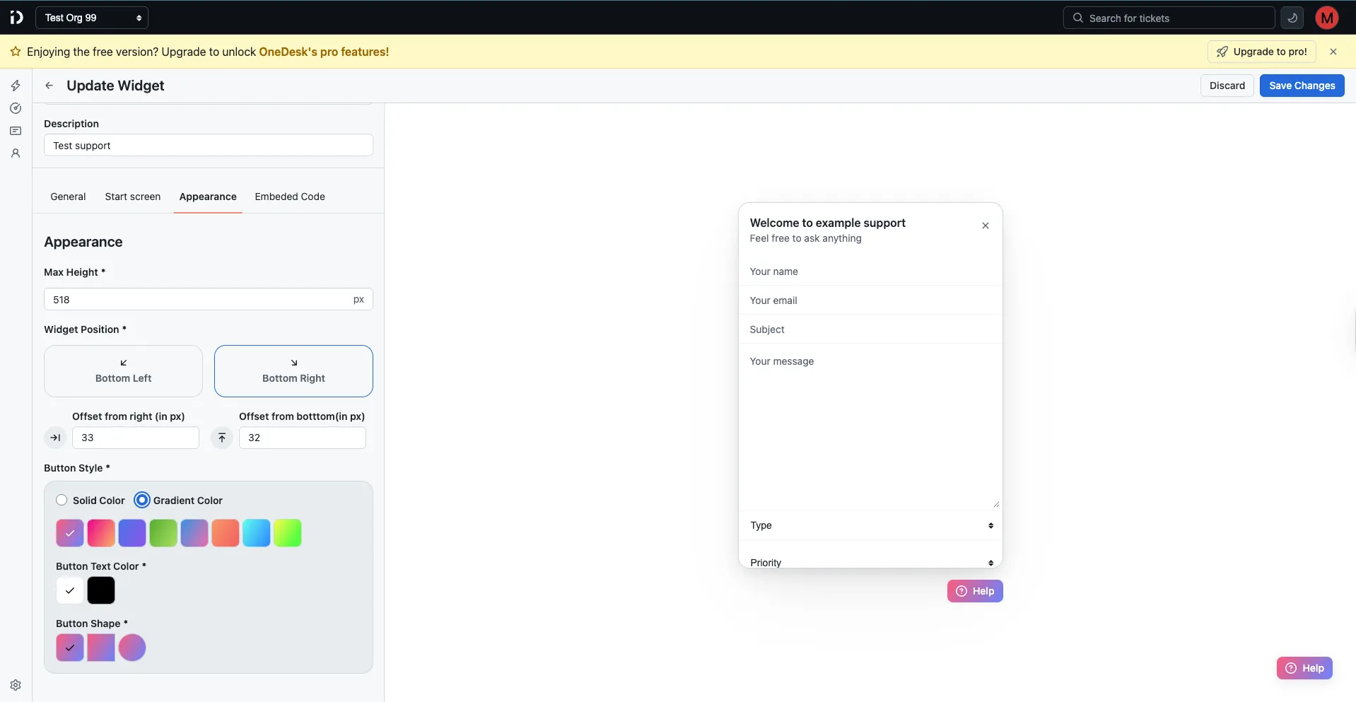
| Setting | Description |
|---|---|
| Max Height | The maximum height of the widget in pixels (e.g., 518px). |
| Widget Position | Place the widget at Bottom Left or Bottom Right of the screen. |
| Offset from right | Horizontal distance (in px) from the right edge of the screen. |
| Offset from bottom | Vertical distance (in px) from the bottom edge of the screen. |
| Button Style | Choose between Solid Color or Gradient Color for the launcher button. Select from a set of preset color options. |
| Button Text Color | The color of the text/icon on the launcher button. |
| Button Shape | The shape of the launcher button (square, rounded, or circle). |
A live preview updates on the right side of the screen as you make changes.
Embedded Code tab
Once a widget is saved, the Embedded Code tab provides everything you need to add it to your website.
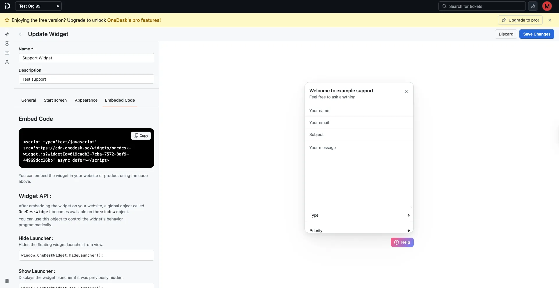
Embed snippet
Copy the script tag and paste it into the <head> or before the closing </body> tag of your website:
<script
type="text/javascript"
src="https://cdn.onedesk.so/widgets/onedesk-widget.js?widgetId=YOUR_WIDGET_ID"
async
defer
></script>
Widget API
After embedding the script, a global OneDeskWidget object becomes available on the window object. Use it to control the widget programmatically:
| Method | Description |
|---|---|
window.OneDeskWidget.hideLauncher() | Hides the floating launcher button. |
window.OneDeskWidget.showLauncher() | Shows the launcher if it was previously hidden. |
window.OneDeskWidget.open() | Opens the widget overlay. |
window.OneDeskWidget.close() | Closes the widget overlay if it’s open. |
Widget Events
You can listen to widget lifecycle events by defining a global configuration object after loading the OneDesk widget script.
How to listen to widget events
Add a <script> tag after the widget script and define the window.OneDeskSetup object:
<script>
window.OneDeskSetup = {
  onOpen: () => {
    //...handle your logic here
  },
  onClose: () => {
    //...handle your logic here
  },
};
</script>
Available events
The following events are available to listen to:
onOpen— Triggered when the widget is opened.onClose— Triggered when the widget is closed.
Widget Default Values
You can prefill widget fields by defining defaultValues inside the global window.OneDeskSetup object after loading the main widget script.
The same window.OneDeskSetup script is also used for listening to widget events.
Example
Add a <script> tag after the widget script and define the window.OneDeskSetup.defaultValues object:
<script>
window.OneDeskSetup = {
  defaultValues: {
    name: 'John Doe',
    email: '[email protected]',
    subject: 'Test Subject',
    message: 'Test Message',
    ticketFields: {
      priority: 'low',
    },
  },
};
</script>
Supported ticket fields
nameemailsubjectmessageticketFields
Ticket fields
ticketFields keys must match your ticket field Property Name exactly.
ticketFields: {
priority: 'low',
category: 'billing',
customFieldName: 'value',
}
Saving or discarding changes
Click Save Changes to apply your configuration, or Discard to cancel and revert to the last saved state.
Table of Contents
On this page